Cool links behave like links
Please just me save files

What do these UIs have in common?
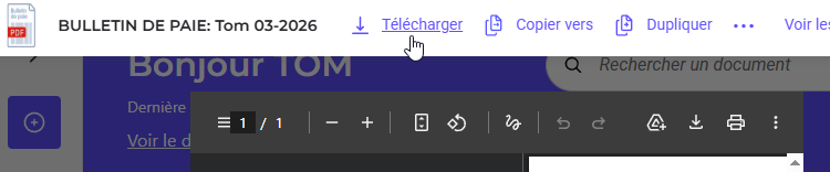


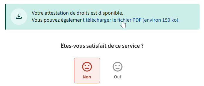
All of the UI elements hovered by the mouse pointer in the screenshots trigger a file download when clicked. Most use <button> elements, the rest use regular <a> links. But none of them behave like links! They all download the file directly without asking you anything, which is alright, but they don’t let you choose.
For random software installers, I don’t really care. But for important documents such as payrolls, insurance, tax forms, etc., I have specific, dedicated folders where I want them to go. And since these links don’t behave as links, I can’t right-click and choose “Save link as…”, I have to move the file from the Downloads folder to the right place, which can’t be done from the browser (simply dragging the file from the Downloads panel will copy it, not move it). This means opening the Downloads folder (either from the file explorer or through the browser), selecting the file, cutting it, navigating to the right folder, and pasting it there. That’s a lot of clicks for something that worked perfectly fine for years until everyone and their dog started using JavaScript to trigger file downloads instead of just, you know, using links to link to stuff.
At least some of the examples I showed have the decency to use real buttons, which from a UX standpoint suggest that you’re triggering a general action that might do things – unlike a link (blue underlined text) that’s supposed to have one meaning: link to something.
The fourth image for example, uses an <a>, but it’s semantically a button. The target is set to # and the download is triggered by JS. This means you can do “Save link as…” but it’ll just save the page you’re on.
General rant
Bastardizing established patterns is a perennial issue in design, especially UI patterns in software design, but most vendors started adhering to quite rigorous interface guidelines in the 1990s (check out the 1995 Windows Interface Guidelines, for example) because they understood, through user research and testing, that humans tend to fare better at using things that behave in a clear and predictable way.
Nowadays bad UI design is everywhere. @tonsky wrote a great article about check boxes becoming round and radio buttons becoming square. This is a global problem that, in my opinion, owes most of its recent resurgence to the following factors:
- the rise of mobile devices (small displays, touchscreens) which introduced new interaction paradigms
- the convergence, in terms of computing power, of mobile devices and regular computers, which made it both possible and financially relevant to run the same software on both, in turn leading to the disastrously bad idea that was the touch-ification of desktop UIs in the early 2010s (e.g. Windows 8’s Metro UI)
- the slow death of skeuomorphism, which while often overused and abused, at least had the merit of making it clear what things were supposed to do by use of intuitive visual cues (e.g. a thing you can press will look like a button, a thing you can fill will be a different color, etc)